Treating Your Screen Like a Room: The Case for Intentional Interface Design
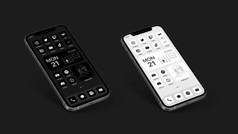
Photo: minimalist phone home screen dark mode clean interface aesthetic, via gridfiti.com
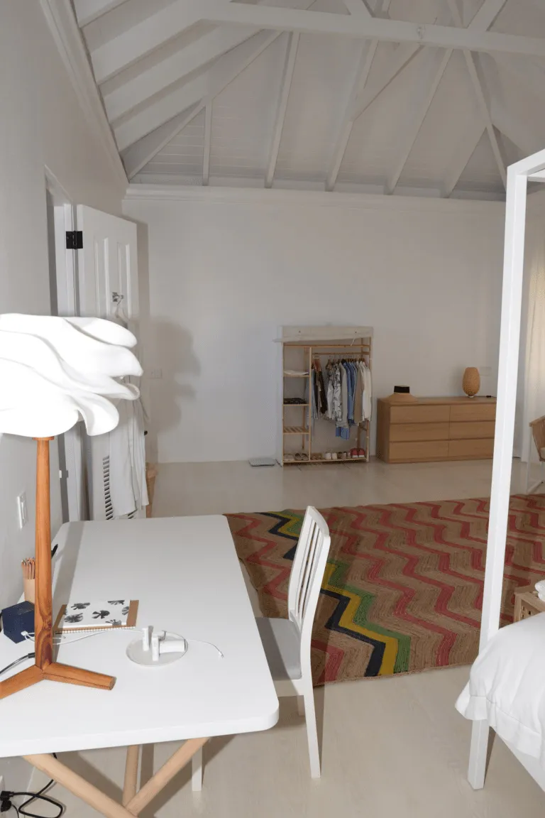
Imagine walking into two different living rooms. In the first, every surface is covered — shelves overflowing, notifications buzzing from devices on the counter, a television playing in the corner, a stack of unopened mail on the coffee table. In the second, there's a low couch, a single plant, a window with good light, and nothing on the floor. Both rooms technically have everything you need. But only one of them lets you exhale.
Now think about your phone's home screen.
For most people, it looks a lot more like the first room. Grids of brightly colored app icons, red notification badges stacked like tiny emergencies, widgets cycling through weather and headlines and calendar alerts. It's a visual environment we spend hours inside every day, and most of us designed it by accident — just tapping "add to home screen" until there was no more space.
But what if we treated our digital interfaces the way thoughtful people treat their physical spaces? What if a screen could feel like a room worth being in?
What Your Interface Is Already Communicating
Designers have known for decades that visual environments shape behavior and emotion. It's why hospital waiting rooms feel different from hotel lobbies, and why certain restaurants make you want to linger while others move you through quickly. Color, density, spacing, and hierarchy all send signals to your nervous system before your conscious mind has processed a single word.
Your phone's interface is doing the same thing, constantly. A cluttered home screen with dozens of apps and a stream of badge notifications trains your brain to expect interruption. It keeps you in a low-level scanning mode — always checking, always potentially missing something. Over time, that state stops feeling like alertness and starts feeling like anxiety.
"The interface is the first thing your brain negotiates with every time you pick up your phone," says Priya, a product designer based in San Francisco who has spent the last several years consulting on what she calls "calm UX" — interfaces built explicitly to reduce cognitive friction. "Most apps are designed to maximize engagement, which means maximizing stimulation. But stimulation and satisfaction are not the same thing."
The Japanese Concept That Reframes Everything
In traditional Japanese aesthetics, there's a concept called kanso — one of the seven principles of zen design — which translates roughly to simplicity or elimination of clutter. It's not about stripping things down until they're bare. It's about removing everything that doesn't contribute to the essential purpose of a space, so that what remains can be fully experienced.
Walk through a well-designed zen garden and you feel this immediately. There are rocks, raked gravel, maybe a few carefully placed plants. Nothing competes for your attention. Your eye moves naturally, your thoughts slow, and you become more present in the moment than you were a few minutes ago.
Now imagine applying that same editorial eye to your digital home screen. What's actually essential? What would you keep if you could only keep ten things? What stays because you use it daily, versus what stays because you haven't decided to remove it yet?
That distinction — between active presence and passive accumulation — is the heart of intentional interface design.
Practical Moves Toward a Calmer Screen
You don't need to be a designer to make your digital environment feel better. A few deliberate choices can shift the experience significantly.
Start with color. Most phones now allow you to set your home screen to a neutral or monochrome wallpaper. Going one step further, both iOS and Android let you switch app icons to grayscale or muted tones. Removing the visual competition of thirty bright icons in different color families immediately reduces the low-grade overstimulation that most of us have normalized.
Create distance from the feed. Move social media apps off your home screen entirely — not deleted, just relocated to a secondary screen or a folder. The friction of having to find them is often enough to interrupt the mindless reach. You still have access. You just have to mean it.
Embrace empty space. Resist the urge to fill every slot on your home screen. White space on a screen serves the same function it does in a well-designed room: it gives your eye somewhere to rest and makes the elements that are there feel more intentional.
Audit your notifications with ruthlessness. Badge notifications — those little red numbers — are one of the most effective attention-fragmenting mechanisms ever designed. Turning them off for everything except genuine communication (texts, calls) doesn't mean you'll miss things. It means you'll check on your own terms instead of theirs.
The Apps That Earn Their Place
A growing number of apps are being built with visual calm as a design principle rather than an afterthought. BeReal, for all its other complexities, uses a deliberately plain interface. The journaling app Day One is spare and quiet by design. Notion, when stripped of its more elaborate features, can become a genuinely restful writing environment. The reading app Instapaper has built its entire identity around removing visual noise from the act of reading.
What these tools share is a willingness to prioritize the user's experience over the platform's engagement metrics. They're not trying to keep you inside them longer than you need to be. That restraint — knowing what not to add — is genuinely rare in the current app landscape, and worth rewarding with your attention.
Your Screen Is a Space You Live In
We spend real time, sometimes four to six hours a day, inside our digital interfaces. That's more time than most of us spend in our kitchens, our backyards, or our living rooms. And yet we give those physical spaces enormous thought — the furniture, the lighting, the arrangement — while accepting whatever default our devices shipped with.
The case for intentional interface design isn't really about aesthetics. It's about recognizing that every environment you inhabit shapes how you think and feel, and that you have more agency over your digital environment than the default settings suggest.
A calmer screen won't solve everything. But it's a daily signal — sent to yourself, dozens of times a day — about the kind of attention you want to cultivate. That's worth a Sunday afternoon of editing.
Treat your screen like a room. Design it like you plan to spend time there.